I admit, I didn’t think the red-violet edges would be that bright.
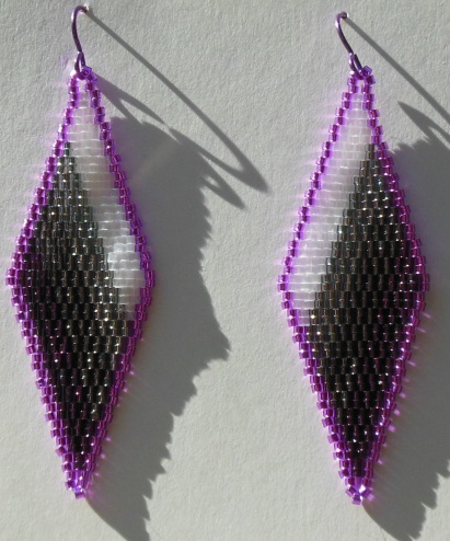
So I figured out how to do stripes!
This particular design is 14 beads across at the widest point. Take off a bead’s width on each side for an edge, and you have a 12-bead width to play with – easily divisible into 4 equal diagonal stripes. A little work sketching on some scrap paper, and I thought I had it.
Of course, you never know how it’s going to work until you actually try it.
This is an asymmetrical design, unlike the original diamonds-in-a-diamond it’s based off of, so the tail thread is particularly important. (The end of the thread leading off from the original knot you tied in the base row, for all of you not familiar with beading; it gets woven into the design after you’re done.) The tail lets you keep track of where you are when you have to put things down, get distracted, or accidentally fumble and drop your beads in progress.
(Who, me? There are reasons I bead instead of knit. One being that yes, I can and will drop just about anything. Delica beads onto a cloth working surface, though, usually take no harm.)
So. Stripes. And gradation of color successfully accomplished in a Comanche-stitch design. I think it works. 🙂
Thoughts, comments?

The colors besides the red-violet and white blur into each other in this photo. Is this an issue for people seeing it in person?
LikeLike
One more thing: purple is my favorite color.
LikeLike
Blur into each other = definition of gradation.
LikeLike
I just noticed the word “gradation” in your original post. And I knew what it meant. It would look better if the entire thing were a gradation of color.
LikeLike
By the way, beyond red-violet and white, what colors did you use? I really don’t want to try to painstakingly match stripes in an online photo with Wikipedia articles list only to find out that not every nuance made it past your camera.
LikeLike
Edge: silver-lined red-violet.
Stripes: Silk white, silver-lined dark silver, silver-lined smoke, silver-lined wine.
LikeLike
That’s “Wikipedia articles listing colors.” Sorry if I confused anyone by not finishing or proofreading my last reply.
LikeLike
And thank you.
LikeLike
They look nice.
LikeLiked by 1 person
Thanks! 🙂
LikeLike
*cocks head* The darkest shade of the gradation seems kinda purple to me. Trick of light or intention?
Either way, they’re lovely!:)
LikeLiked by 1 person
It is indeed purple. (Silver-lined wine, if you want Delica’s specific color name.) Ace flag! 😉
LikeLike
Oooooo, pretty! 😀
LikeLiked by 1 person
🙂
LikeLike
Wow, that /is/ bright! But that’s nice; the ace flag often looks intentionally dull. This subverts that. …I like the idea of playing up the purple, actually. We’re not dull, we’re weird.
LikeLiked by 1 person
Which is a shame; the same colors were in Victorian half-mourning, from my research, and they had ways of putting it together that were not dull. 😉 So I thought I’d punch it up a little.
LikeLike
I’m waffling on these. In the picture, the purple outline is dramatically bright. The rest of the design is smoky and subtle. However, your earrings have always looked better than their photos. I find the asymmetry and the gradation lovely. That bright purple outline though…It’s very dramatic. I have friends who would swoon.
LikeLiked by 1 person
Awesome! I’ll have to post these on eBay… when I’ve had a little more sleep. *Wry G* Edits, they eat the brain….
http://cgi.ebay.com/ws/eBayISAPI.dll?ViewItem&item=182513958603
LikeLike
Niiice. I like them a lot. I like the silver/wine on the lower edges, and I think the difference in stripe colors would be just obvious enough in person. You’re making me want to get my ears re-pierced, I neglected wearing earrings for too long and the holes closed up.
LikeLiked by 1 person
I can also do clip-ons? 😉
LikeLike
Hmm, I like the earrings, but I do think the red-violet is a bit bright. It takes away from the subtlety of the pattern, in my opinion. Maybe a more muted shade, or a blue-violet instead?
LikeLiked by 1 person
Will look into that, thanks. 🙂
LikeLike