This is another design my artist associate put together.
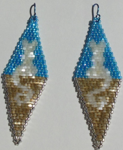
I think I need a higher-contrast color for the wall the cat is sitting on, but for a first stab at putting it together, it works. The top is relatively easy to put together, but the bottom with the asymmetrical tail… not so much. Not helped by the fact I have to turn the diagram upside-down to work on the bottom, which ends up “reflected” from the direction I actually need to be working.
…I may have mentioned before my brain hates spatial manipulation of images. Maybe once or twice. 😉
Once I had one earring done, it was much easier to just flip that over and follow it without worrying about the diagram so much.
I was trying for “white cat on a weathered wood wall against blue sky”. Thoughts, suggestions?

I thought they were plot bunnies
LikeLiked by 2 people
That explains so much….
LikeLike
Haha, I thought Bastet for a minute there.
LikeLiked by 1 person
🙂
LikeLike
Oooh, that’s an awesome idea!
*starts figuring how she could get a fennick’s outline instead of a cat’s*
LikeLiked by 1 person
*G* Let me know if you make one; I’d love to see it.
LikeLike
Mine would be done in pony beads with my kids, so unlikely to be that impressive, but aye aye!
LikeLiked by 1 person
Thanks! 🙂
LikeLike
Very cute, though the tails seem a bit long.
LikeLike
Disclaimer: The following should be taken with a golf ball sized grain of salt. I have no real aesthetic sense when it comes to earrings. Hell, when it comes to anything general.
It might work better if you removed the white beads from the cat, or paired the white with a mellow golden orange instead. The white stands out a bit too much in the grey and just seems… off. But white paired with a darker shade of orange brings to mind tom cats (or so says the cat in my lap) which would mean less distraction/detraction, maybe…? Or maybe a softer white, closer to the grey coloring, so it all blends more evenly.
LikeLiked by 1 person
Thanks, will consider the next time I pick colors.
LikeLike
You may want to add some emphasis lines to make the fact it is a cat more clear. I dunno how that might work with beads but it might be something to look into
LikeLiked by 1 person
Unfortunately that’d probably need a bigger earring – not much room to spare as it is.
LikeLike
Possibly if you replaced the outside beads for the cat?
Not sure… all the models for figuring out what it looks like don’t work so well, and it’s an awful lot of work to MAKE the whole thing each time!
LikeLiked by 1 person
*Nod!*
LikeLike
Possibly if you replaced the outside beads for the cat?
That’s why they invented Photoshop! (Or other picture editor of your choice.)
I don’t think outlining the cat would work, especially down in the tail – you’d lose a lot of the curve.
LikeLike
Darn. Unless you find someone who wantz to help widen the gage holes without actually using gages… lol
LikeLiked by 1 person
I like it.
The more abstract shape of the cat superimposed over the geometric blocks is both attractive and relaxing to the eye,
Usually the combination of blue and brown is too discordant to work well (and I don’t care what color theory says). These hues of brown and blue seem to work together, thought there is something mismatched about the saturation. Perhaps a less brilliant blue?
That would make the cat less easy to pick out, which might not be a bad thing. But if you want the cat to be easy to see, gray might be a better color for the wall than brown.
*shrug* Free advice, worth exactly what you paid for it. ^_^
LikeLiked by 1 person
Thanks! 🙂
LikeLike
Honestly, given the name and the blue sky, I thought the cats were just clouds in cat shapes. Couldn’t figure out what the brown was, but I like the ethereal yet mundane feel of them. It’s a strange dichotomy, lending itself well to the idea that a cat is in two worlds.
Gimme a sec, I can English Teacher these. The brown represents the regular world, steady and solid. The cat however is gazing up into the sky, to the unknown, and is slowly drifting across. (Love the way the outlines feel almost smoky and they feel so hazy, lending itself to the initial impression of not there.) Is this a cloud that’s shaped like a cat, a white cat, or maybe even a cat changing to a cloud or stepping through a doorway?
I did really well in English classes in school. The glory is that you can assign symbolism to just about anything and then defend it.
LikeLiked by 1 person
The brown could also be the sand of Egypt, as the pale cat steps away from a mortal existence. An incarnation of Bastet contemplating her realm, the sky, or studying her hapless prey.
Amazing what having sleep can do for you.
LikeLiked by 1 person
…Huh. *Nod*
LikeLike
*G* Nice.
LikeLike